Hi, I am Maximilian.

Let me help your digital transformation by designing innovative digital products for your target group.

Learn more about my services

  • kununu-Website
  • mobile.de-Website
  • mobile.de-Apps
  • hotel.de-Website
  • Clnnr App Screenshot

Portfolio

Unfortunately, lots of my work is under NDA.
So I picked a variety of free and conceptual works to illustrate my thinking around customer value.

Improving search

Updated search interaction for kununu
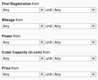
The Why

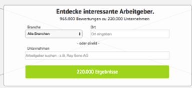
The employer review platform kununu realized a challenge with findability of companies. Time on site, visited pages and stickyness of the website were not meeting expectations.
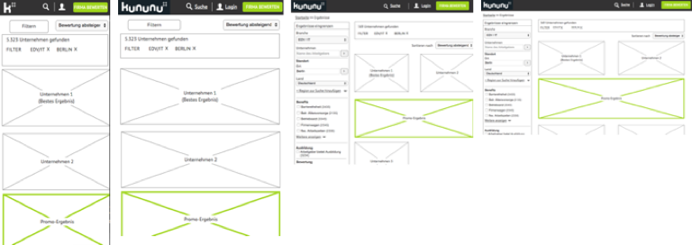
The challenge

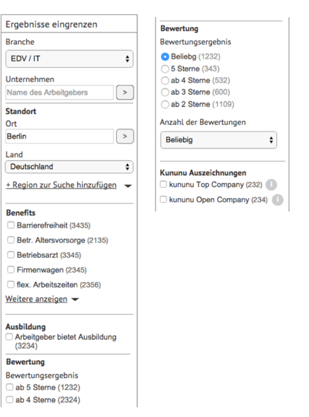
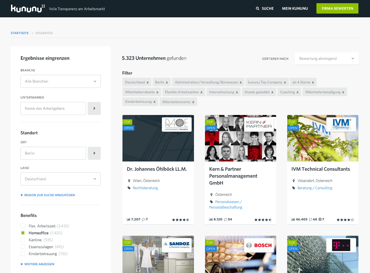
Improve findability of companies and inspire vistors to spend more time on company profiles. Let users easily filter and narrow down their search results with a focus on users who were looking for a new employer within a specific business sector.
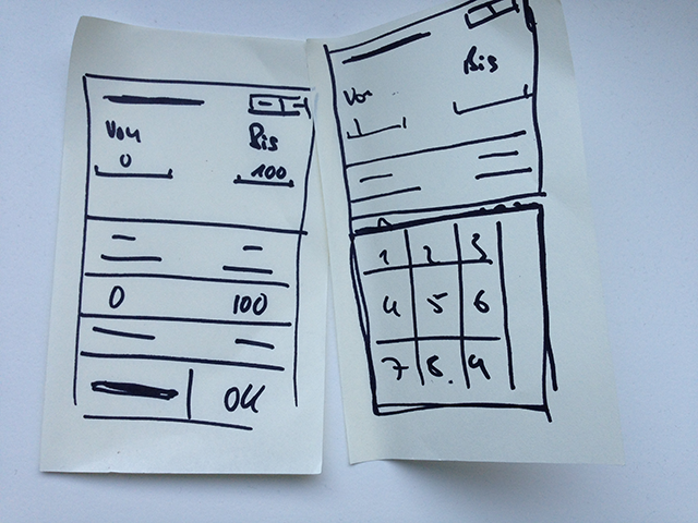
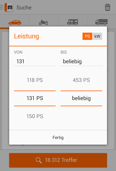
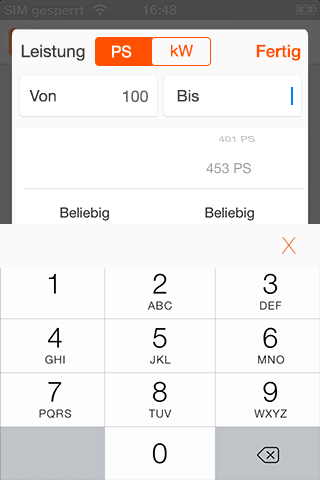
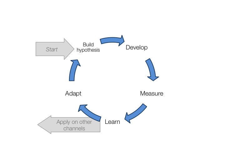
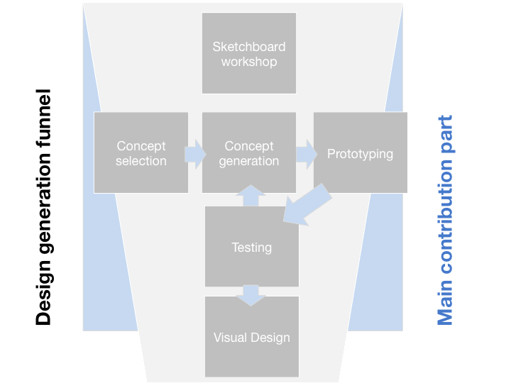
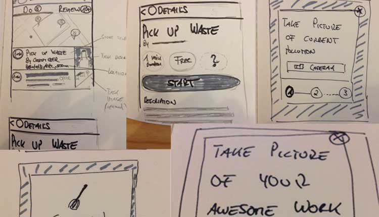
The Process

As freelance interaction designer I worked together with the product manager to understand the current analytics and qualitative data. Based on the data I developed a variety of concept ideas. After some review processes we decided on variants to be tested in an usability test. The concept was updated based on the feedback and hand over to visual design and development.

The outcome

The defined metrics were improved and the client kununu decided to also recruit myself for an iteration of the detail page.

My role

I worked as Interaction Designer and focused on concept and prototyping for the usability test. After the inhouse visual designer has created the visuals based on my concept and also developed the visual designs further.

Visit Website>

Small Changes, High Value

Custom picker for multiple channels

The Why

Before I joined mobile.de found out that free value pickers for form elements are highly accepted on the Desktop site. To leverage that positive effect the feature shall be rolled out to all channels.

The challenge

Redesigning already existing mental models of standard pattern contains a high risk. Therefore we had to take care that the established pattern does not suffer but we enhance the user's experience through additional functionality.

The Process

Within the Android app development team (product manager, developer, QA) we conducted a Good Design Faster workshop to leverage the ideas from a all teammembers.

The first outcome

To test the feature we conducted a café study to see if the feature was still usable. The new feature was well received by user and the business gained a similar uplift as seen on desktop. Therefore I adapted the feature on iPhone.

iPhone adaption

Mobile web design

To explore further implementation ideas another Good Design Faster Workshop was conducted with the mobile web team. First concept scribbles were really close to the app solution but did not resonate well since I expected it to be to complicated. I went through another round of ideation and came to the following solution.

The outcome

Through site feedback we receive good comments and overall usage is high. The mWeb version will replace the touch-unfriendly version of the desktop in the nearer future.

My role

I was responsible to deliver the custom picker feature "mobile-ready" and enhance it to touch friendly version on mobile web. I facilitated the ideation within the workshops and developed the rough concepts further. Therefore I created the visual design and the interaction design details.

Visit Mobile WebsiteVisit Desktop Website

Leading bigger changes

IxD/Visual Design Vision

Disclaimer: I can not go into explicit details since this is still work in progress.

The Why

To represent brand and product family better the product management wanted to update the overall design language of mobile.de

The challenge

  • How can mobile.de approach a major redesign without distracting to much users?
  • How should visual changes and interaction design changes be handled?
  • How can the changes be lead with external designers and internal development

The process

Together with the product manager I agreed on a hypothesis driven redesign where small iterations would help us to learn and to adapt if visual changes lead to problems with business numbers. That way we were able to identify visual design problems early and benefit from those learning when we transfer the design vision to other channels.

Latest states

iPhone

Android

My role

I am the responsible interaction designer for the project. My job involves giving guidance to the developers and the product manager about necessary IxD changes. As a plus I work closely with the external visual designer to guide his effort and make sure the decisions stay pragmatic und focus on our design hypothesis.

The outcome

Work is still in progress on both platforms. We managed to stay at at least 4 star rating throughout all changes while maintaining or improving business metrics.

Calendar with added value

Designing a price calendar

The Why

Based on research the team knew that leisure travellers are often don't have a fixed date and can decide when to travel. The product team decided that the best way to tackle that user need is to come up with a price calendar to support users finding the best date for a specific hotel.

The How

The UX Team brainstormed different interaction designs in a sketchboard sessions. Then the beta concept was developed and tested in an uselab. The product then went live but not with the expected impact. To find out what about the problems I went out of the building and used the café test method. That method gave me enough insights to quickly iterate on our solution so that the product could be improved.

My role

I was responsible for ideation and designing the product's experience. As I went café testing I also served as UX researcher and facilitator of a quick prototyping process. Therefore I was albe to push quick product iterations.

The outcome

After the product first did not hit expectations the user acceptance increased dramatically after the next iterations that were based on rapid usability sessions.

Visit price calendar

One task to a cleaner world

The clnnr app

The Why

People have idle times in public spaces all the time. Most of the time they spend ordering their digital life but never do anything more beneficial for the environment. Especially in public spaces a lot of stuff lies around the could be cleaned up. Usually this would not take more then 2 minutes. So let's bring people with a short amount of time and dirty environments together to create a cleaner living.

The Process

Based on my observations I found the concept of micro-tasking environmental change to help both cities and citizens mostly appealing. To structure my thoughts around this and to find out the business value of the idea I used the business model canvas.

So I thought of a two tiered business model where users would be rewarded through the service for the environment. On the one hand by gamification elements and status. On the other hand by small monetary rewards for tasks that are introduced by public services or cities, i.e. "Clean here and you get 1 €!".

So the second tier would be the on-boarding of public services to take part in the service and show them how they could save money with the service

Storyboarding

Especially with new experiences I like to storyboard potential user stories. This helps me to really define the value of the idea in more realistic environment.

Concept

Whenever I work on my own I try to do most wireframing on paper. This gives me the freedom to jump into paper prototyping easily.

Visuals

My role

I solely work on this project, so idea generation, concept, visual design and prototyping is currently my responsibility. I work on this project in my spare time as I feel that it has a lot of potential. It's a location based service to create a greener environment with the help of the crowd.

The outcome

I like to start lean so the first thing was to create a landingpage and see if people would click on "Download". I seeded the link in design networks and I had a click through rate on the fake button of 82 %. That's nice but still a long way to go.

All visual designs are still work in progress therefore only a few screens are ready and screen will be updated on an ongoing basis.

Visit test website (old visuals)

Enabling a Good Choice

Researching a decision support system

The Why

Should I go with the hamburger or do I prefer my cesar salad? Why doesn’t the waiter know which ingredients this sauce contains?

The How

The goal of this scientific project was to support the guest’s decision on a typical day-by-day situation like ordering food. We constructed a custom made multitouch table and designed, prototyped and build a decision support system for everyday decisions based on the guests profile, her allergies and favorites.

My role

My role in this project was to design the interactions, create the visual design and to code the software in Action Script 3. We used CCV and our hand-written multitouch framework.

The outcome

The project was shortlisted at the World Usability Day in Mannheim. Usability-Test of the tabletop concepts looked promising and most users preferred the system against a normal menu.

Visit Website

Designing services for a bathroom

The intelligent bathroom

The Why

What future services for a bathroom could be imagined. How can companies innovate here? Which services make sense?

The How

To find out about that and which service would be needed the team build a dummy bathroom and installed different services to test those with users.

My role

As a team member of the EU boosted project “Interactive Knowledge Stack” I was responsible for designing and developing the UI for an interactive mirror, a context aware shower wall and the mobile app for the intelligent bathroom.

The outcome

The bathroom has been featured on TV many times and generated some press attention (see on project site). User feedback on interface and concept was good. The service design was groundwork for more than 5 scientific publications.

Visit Website

What I Do

I do digital product design with a strong focus on innovative and user centered solutions. I believe in value and hypothesis driven UX design to build great products.

Cross Device UX

I want products to be successful on a variety of channels. So I embrace the work for all screen sizes.

Lean research

Running lean means to research design hypothesis with just as much effort as necessary.

Light Deliverables

Deliverables to help the team to get to the next step. No more, no less.

Bridging the gap

I bridge the gap between technology, business and the user with latest design methods.

About Me

Maximilian Wambach

On a freelance basis, I have been building and designing digital experiences from large to small for over 6 years until I found that my heart beats especially loud for well-crafted UIs, interaction designs and design management methods. For over 4 years I did interaction design, UX research and digital product strategy for inhouse product development teams for the eBay Classifieds Group, hotel.de GmbH or Siemens Heathineers. To tackle the real big challenges of future healthcare systems I have joined Novartis 3 years ago as Digital Solutions Manager. I am now heading the Digital Innovation & Acceleration team of Novartis Germany.

I tweet, write and talk occasionally.

When I am not in nerd mode I love to surf, swim, run and drink coffee.

Say hello

Some things I know

75

UX Research

99

Interaction Design & Usability

90

UI Design

90

Design Methods & Prototyping

Drop Me a Line

Just say hello, ask for project support or ping me for discussions or feedback.